Thursday, 5 May 2011
Feedback for Branded
 Above is a screenshot of the link to our Media film on my Facebook wall. As seen from the comments and the amount of likes, people seemed to have a positive view on our footage.
 I showed the film to some individuals and asked them for their opinions, and these were their responses:
Hannah Emery
I enjoyed watching your film opening, as it created alot of questions and made me want to see the rest of the film. I found that the lighting in your film was very effective, as it created the tone of the rest of the film instantly. I liked the location you chose for filming, as it seemed quite remote. However, I think it would have been good for the audience to see more of your character.
Edward Stow
Your film definately made me want to find out what happened next in your story. I like the newspaper cuttings and pictures, and how quick the pacing of the editing was. But I think that perhaps you could have made the news report a bit shorter, as it could make people get bored of long dialogue.
Miranda Amess
I thought that your film was very interesting! The mise-en-scene and set design was very well done; I particularly liked the panning shot of the tools on the desk, it really gives an insight into how violent the main character in your film is. I like how the character was mysterious, as the audience did not really see much of him. The effort that you put into your filming is evident, as the film looks professional and well-put together. I can't really think of anything you can improve on!
Conclusion
Overall, I am very pleased with how our media film turned out. I am pleased that we had to refilm it numerous times, as it means that each time we improved the quality of our footage until we were happy with the final product. The music, cinematography, editing, lighting, set design and colour all work together to create one opening with great effects both visually and audibly. I am very pleased with the consumer reaction to our media project, as it proved to be very popular. We put alot of effort into this product, researching the type of people which would want to go and see it; what kind of production company would distribute it and what to include to appeal to our target audience. Taking all of these different views on board, we created our film, which I feel targeted it's audience effectively. We ensured to stick true to our chosen genre, and include various mise-en-scene and prop elements to show this to the audience, as it needs to be clear what kind of film we are making. We also ensured that we had to create a whole story to the film, despite only creating the opening, to add a sense of realism, which I feel we did so effectively. We also all worked well as a group together, all helping each other at various stages throughout the production of Branded.
Wednesday, 4 May 2011
Looking back at your preliminary tasks, what do you feel you have learnt in the progress from it to full product?
Above is our continuity editing task. The first task we had to do was match on action. We done this by having the girl walk through the door, and then showing a different shot of them walking into the room and closing the door. These two clips had to be edited in perfect time together to create the desired effect.
The second thing we had to do was a shot revere shot. The camera had to show the two characters having a conversation, but by using two different shots. The shots had to stay the same on both characters as otherwise the character positioning would not make sense.
Overally, doing these tasks did help us when creating our final project. It got us used to using the cameras, and helped us to ensure that all of the footage made chronological sense. It also got us used to the editing software, Adobe Premiere, as the clips had to be put into a timeline and edited together. This got us used to using the software when it came to editing our film. The match on action preliminary task was extremely helpful and productive to our film. This is because there are numerous shots which required this in our film; the character opening and shutting a door from two different perspectives, and the character throwing the cross on the floor from two different perspectives. The tasks greatly helped us when it came to shooting and editing these particular scenes.
How did you attract/address your audience?
Above is the final draft of our media project, Branded. On this video I have annotated various key shots and spoke about how they are used to create meaning. I also focused on numerous other mise-en-scene elements. This addresses the audience as it allows them to see the themes which are in our film.
Tuesday, 3 May 2011
What have you learnt about technologies from the process of constructing this product?

We used multiple different products to produce our film. To film it we used a small digital camera, which did not produce the highest of quality images, although it was small and compact, which was an advantage as it was quite a commute to get to our filming location. When we first filmed it, we did not take a tripod, and noticed that the footage was quite shakey and unstable. The correct this problem, we re-shot the footage and ensured that we brought a tripod to make sure that the footage was of a higher quality standard.
Once we had shot the footage, we uploaded it onto an Apple Mac in the school Recording Studio, as shown in the picture above. It was easy to upload as all we had to do was connect it, upload it and ensure that we made a copy incase anything happened to the footage. Then, we converted the footage uploaded our final piece onto YouTube. Uploading it onto YouTube was quite difficult, as it kept encountering errors during the upload. However, with some help from our peers we managed to overcome the problem and upload our footage so that we could get feedback. We also found our music on YouTube, checked that is was not copyrighted, and used an online video converter to get the footage onto Premiere.

1) The importance of tripods when filming, as although certain camera's are good without them, to get the best footage tripods are important
2) How to upload the footage onto Adobe Premiere.
3) How to add effects onto footage in Premiere, including fades, dissolves and more.
4) How to add titles onto the footage.
5) How to add titles next to the footage.
6) How to import music.
7) How to important video footage.
We also used iTunes to import our music, Google to find out various information about our chosen genre and target audience, Blogger: to record our progress, YouTube: to watch various other openings to other thriller/horror films, and also to upload out final product. We also used Facebook to share our film with a diverse range of people, and to get their opinions on it. I also uploaded our footage onto the website Tumblr, to see people's opinions on our footage.
We also used iTunes to import our music, Google to find out various information about our chosen genre and target audience, Blogger: to record our progress, YouTube: to watch various other openings to other thriller/horror films, and also to upload out final product. We also used Facebook to share our film with a diverse range of people, and to get their opinions on it. I also uploaded our footage onto the website Tumblr, to see people's opinions on our footage.

Who would be your audience for your film?

This is Jim Cowan, a twenty-five year old man. He lives in the capital of London, and is a lover of film and television. Ever since he was a child, Jim has known that he has wanted to go into the area of film as a career, and is currently studying Film Studies as a degree at University. He enjoys watching films for both leisure and also to analyse.
He enjoys a range of activites: being with friends, visiting the cinema, football, playing the guitar, surfing and playing video games. He finds a balance between having a good social life with his friends and also ensuring that he has time to catch up on the latest films. He tends to buy films, as opposed to renting them, as he likes to have them added into his collection.
His favourite genre of film is thriller. This is because enjoys watching a film which grasps his attention for the whole duration. Thriller films offer this experience, as you are constantly in a state of worry as to what is going to happen to the characters. Some of his favourite films in this genre include Saw, Paranormal Activity, Final Destination and The Crazies. However, he also enjoys films outside of this genre, like Star Wars, Lord of the Rings and Back To The Future. He has recently been to the cinema to see the new Scream 4 film, as he has followed the franchise for many years. Some of the music which he enjoys listening to are bands like Fall Out Boy and Lostprophets, both of which are rock bands.
Our film is targeted at people like Jim, as he is the most likely kind of person to see the film. However, it is important to remember when marketing not to focus too closely on one kind of person, as this can alienate other potential viewers and prevent them from seeing Branded.
What kind of media institution might distribute your film and why?
We created our production company, Unearthly Productions to produce our film. This involves all of the creating and funding of the film. The types of films that they produce are horror/thriller, and use a mix of cinematography and mise-en-scene to create a reaction in the audience.
Distributors of horror films:

Lionsgate films have distributed the Saw franchise in the USA. They were very effective at doing this, as represented in the success of the films and their sequels. They are also a well known distributor of the horror genre, this will mean that our film will become more well known if it has a good distributing company.

Paramount Pictures distributed Paranormal Activity. They done this very successfully, and marketed the film in such a way to grasp audience's attention. They showed audience's reaction to the film in the trailer, which immediately made potential consumers interested.

The distributor Dimension Films distributed the film 'Scream', which is an iconic horror film.
The distributing company which I think would distribute our film would be Lionsgate films. They have produced numerous iconic films over the years that the company has produced, and they all seem to be of the highest quality. The films which they distribute share similar themes with ours: death, pain, suffering, and ultimately result in scaring the audience. Lionsgate can also distribute a range of films, from mainstream blockbusters, to independent films which are targeted at a more niche audience.
Distributors of horror films:
Lionsgate films have distributed the Saw franchise in the USA. They were very effective at doing this, as represented in the success of the films and their sequels. They are also a well known distributor of the horror genre, this will mean that our film will become more well known if it has a good distributing company.
Paramount Pictures distributed Paranormal Activity. They done this very successfully, and marketed the film in such a way to grasp audience's attention. They showed audience's reaction to the film in the trailer, which immediately made potential consumers interested.
The distributor Dimension Films distributed the film 'Scream', which is an iconic horror film.
The distributing company which I think would distribute our film would be Lionsgate films. They have produced numerous iconic films over the years that the company has produced, and they all seem to be of the highest quality. The films which they distribute share similar themes with ours: death, pain, suffering, and ultimately result in scaring the audience. Lionsgate can also distribute a range of films, from mainstream blockbusters, to independent films which are targeted at a more niche audience.
How does your product represent particular social groups (gender, age, ethnicity, class, religion)?
The character of Laverick is 31 years old. He used to be a successful millionaire, with a wife and two children, until a fire broke out in his mansion. The fire tore through his home, burning everything in it's path: including his wife, his children and his business. He was left with nothing. Consumed with revenge, Laverick believed the fire to be an arson attack, he began killing people mercilessly, who had any kind of connection to the fire. The back story of Laverick emphasises the divide between classes, the upper and the lower, even in this modern age, and it shows how easy it is for a person's life to be changed instantly within just a few minutes. For the age group that Laverick belongs too family is very important in modern society, and our film reflects this. When family is taken away people can react in terrible way, overrun by grief. Laverick's family was the most important thing to him, and through the acts of certain people, they died. Our film also shows that although alot of killers and muderers in this world are evil, they usually have had something happen to them in their life to make them act in such a horrible way.

There is one shot in our opening sequence of Laverick throwing a cross on the floor. The scene symbolises Laverick's loss of faith, and has been revealed from our audience research that it is very powerful. Laverick once believed in God and Christianity, but since the death of his wife and children his faith has been very neglected. This is representative of what can happen during one's life; although faith can be a good thing and give people hope, it can also make one think of why there is suffering in the world.
We took inspiration for our character from the film 'Saw'. The antagonist of the film is a man named 'Jigsaw', a man who commits numerous evil deeds over his life time. He puts people in terrible situations to test their will to survive. However, the character is not just a mindless killer. He was driver to his deeds, as revealed in the third film, due to the death of his unborn child by a robber. Ever since then, and his cancer, he has wanted to test people to see if they can pass his cruel tests. He is a very mysterious character, and nobody knows his true identity. He is extremely isolation from everyone else in society, which is very similar to Laverick. On the other hand, Jigsaw does not actually kill, he merely puts people in terrible situations and watches them die. This is unlike Laverick as Laverick actually commits his crimes.
Below is a picture of Jigsaw from the 'Saw' films.
In what ways does your media product use, develop or challenge forms and conventions of real media products?

The close up of the lamp turning on emphasises revealing: it is revealing the truth to the character. It also emphasises the fact that he is isolated from the rest of society, due to the fact that it has a shot of unnatural lighting, which is in contrast to the outisde shot, with natural lighting, showing that he is seperate.
The shot of the barred windows emphasises that he is seperated from society and that he is perhaps dangerous. The rain immediately sets the mood of the film: negative with heavy undertones. Rain is a typical horror genre convention, as it immediately lets the audience know the tone and setting of the film will be.
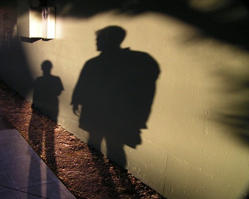
Another example of a way that our film uses the conventions of the horror genre is with the use of shadows. Shadows can emphasise numerous things: vulnerability, mystery, danger. In this case, it represents Laverick's mysterious personality. This puts the audience on edge, as shadows give the impression that somebody is behind you.
The name of our film is 'Branded'. This is key to the horror genre, as when we researched into names we noticed that the name had to be to the point of the film. Examples of this are films like 'Saw' and 'Scream'. Both of these names gives the audiences clues as to what the film will be about, but not too much.
The narrative of our film is a key convention of the horror genre. It involves violence, revenge and a killer. These three aspects are key to the success of the film. It is important to keep the motive of the killer fairly hidden until the end of the film, thus to keep audiences interested. It is important to drop a few hints in the film, however, so that audiences can begin to piece together some parts of the information and guess themselves the motives of his actions. We done this in the opening of the film, by panning across a few key words in newspapers.
The title of the film/Title font and style
The title of the film, 'Branded', appears at the end of the sequence, as the door slams shut. The loud bang of the door slamming allows the audience to know that the name of the film itself will be very important to the plot of the film. The title font and style are the same for the Production Company (as seen in the top right image), the title credits and of the film name. We felt that this use of consistency in font and colour let the opening sequence flow more easily together, and linked all of the shots together perfectly. The font itself is quite Gothic, seeming fairly sharp. This introduces the audience to the genre of our film. The use of the black and white colours are fairly bland and depressing, which helps set the tone of the film. We took inspiration from this from title sequences such as 'Final Destination' who used the same font and style in both the title credits and the name of the film itself.

Setting/location
The location of the film is extremely effective. It is quite worn-down and seems secluded from the rest of society. The shot of the barred windows really emphasises this point, as it shows that Laverick is seperated from everyone else; almost like a prisoner. This is representative of his mental state - he feels like he belongs in a seperate place than everyone else. Inside of the workshop in which Laverick hides, there are many tools and weapons layed out on the desk, showing the strong violent themes within our film, which would continue if we were to make it as a feature film. The colours and lighting in the workshop are subdued and dark, representing Laverick's character.
Costumes and props
The costume of Laverick is quite plain and simple. We purposely chose to dress Laverick in such a way so that the audience would be reminded that Laverick was once just an ordinary man, who had his whole life changed in an instant. The shot of his muddy trainers show that he has been out of his workshop recently, allowing the audience to ponder on why this would have been.
The props in our opening sequence are also used to great effect. The shot of the blood on the knife truely emphaises this. There is one key shot of the radio which is highly important. This is because you can see Laverick lift up a knife in the reflection of the radio, as the news report plays overhead. This particular shot shows us the connection that Laverick has with the rest of society - violence. He only seeks revenge.
Camerawork and edting
There are numerous editing techniques used to portray meaning. The shot of the production company name fading into the shot of the radio is one, as it connects the titles to the rest of the film, allowing them to seem like they belong with the actual footage. As the opening sequence progresses, the editing picks up pace, and becomes more and more unsettling for the viewer. This is particularly shown in the shots of Laverick crossing out people's faces in newspapers, and underlining key words which have relevance to him. In some shots, we purposely made the camerawork appear to be slightly shakey, thus to represent Laverick's mental welfare - unstable. However, in our first draft we overused this technique, so we corrected it in our final piece and only made the footage appear to be slightly shakey in certain scenes. The camera is also positioned in such a way so that the audience never get to see too much of Laverick's body - thus adding to the mystery of the character.
Story and how the opening sets it up
The story of 'Branded' is about a once successful millionaire. He lived in a luxurious mansion with his wife and two children, before it was horrifically burnt down in a terrible arson attack, in which his wife and two children perished. Laverick went missing for two years, and mysterious murders started happening around London, all of whom were connected to the fire in some way (the police men, the judges who released the arsonists, the arsonists themselves, the fire men etc.) Laverick becomes consumed with revenge, and kills all of his victims in a certain way (but slitting their throat and by branding their skin with an emblem of fire. Can the police stop the deranged killer before it's too late?
Our opening sequence has strong links with the story of our film. The scene begins with a news report being played on the radio, all of which are to do with the murders which Laverick has commited. There are also newspaper cuttings which depict everyone connected with the fire, and show Laverick crossing them out - suggesting their impending death. As the opening sequence end, the audience see Laverick exit his lair after marking an 'X' on a map, showing them that he is going to commit another murder. This leaves the opening in such a manner that it would be easy to pick up from if we were actually making the whole film.
Genre and how the opening suggests it
The genre of our film is horror/thriller. Numerous techniques are used in our film to portray this.
One convention of real horror films which we drew inspiration from was the idea of weaponary. Weapons, such as guns, knifes, swords, nails and more are always used as one of the main props to promote that the film belongs in the horror genre. Weapons are what is used to do damage to people, thus it induces fear into the audience. One particular shot which shows this is the one of the reflection of the knife in the radio. The camera is positioned in such a way so that the light from the lamp bounces off the knife. This shot, I feel, particularly emphasises this point as the short is quite brief, which makes the audience unsure to what they have seen. We used a panning shot of tools on a desk which are organised neatly, showing the violent aspect of our film. This shot also shows that Laverick only cares about his weapons, which is quite disturbing.
Another key shot in our film which portrays the horror genre is the one of Laverick wiping blood off a knife. This strongly hints at gore, and shows that this character will stop a no lengths to get his ultimate revenge. The blood on the knife strongly emphasises the horrofic side of our film, as it strongly hints to violence.
The use of lighting is a horror convention which we drew upon. We purposely dressed the set in such a manner so that in any shots that Laverick appears, shadows will be cast across the wall. This adds a sense of mystery and enigma to the whole scene.
How characters are introduced
Laverick is introduced with him opening a door. However, you only see his hand and a small proportion of his body. We continued to do this throughout our whole film, and only showed certain parts of his body. This gave the film a sense of mystery, making the audience wonder as to what Laverick really looks like. This also keeps his identitiy hidden, which makes the audience wonder who he really is...

Wednesday, 6 April 2011
Soundtrack
We found the soundtrack to our music on YouTube. The soundtrack appears to be fan-made, and we researched it to check that it was not copyrighted. Once we were sure that we were not breaching copyright laws, we used GarageBand to convert the video into an mp3 format so that we could use it as a soundtrack to put over the top of our film. It worked extremey effectively with our opening sequence, as it used a range of instruments (mainly piano), to create a high level of tension in the audience. The msuci is very typical of the horror genre, as it puts the audience on edge. It allows the spectator of our film to imediately see that it belongs in the horror genrand that the antogonist will be partiuclarly horrific and evil.
Tuesday, 5 April 2011
Foley Sound
Foley sound is the creation of your own sound. Foley sound is used in many major films and television shows, as sounds have to fit the action that audiences see on screen to ensure that the visuals are believable. An example of this would be, if a man is walking down a street then the audience would expect footsteps to be audible. This will create a sense realism to the audience. Foley sound will not be a large aspect of our film, as we are having voice-overs and quite music for most of it, but we do need to consider this in our film.
To make our film authentic we will have to take foley sound into consideration. We will be creating some of our own sounds, which will include rain, footsteps, a door slamming, a door creaking (undecided), the sound of a radio out of tune and many more. To do this we will record each of these sounds individually and then simply delete the video footage. To get the sound of rain pouring down a window we will use a hose-pipe and a window and record the sound. We will repeat the process of this with all of our other objects. This will make our film seem credible, and give it a sense of professionalism.


To make our film authentic we will have to take foley sound into consideration. We will be creating some of our own sounds, which will include rain, footsteps, a door slamming, a door creaking (undecided), the sound of a radio out of tune and many more. To do this we will record each of these sounds individually and then simply delete the video footage. To get the sound of rain pouring down a window we will use a hose-pipe and a window and record the sound. We will repeat the process of this with all of our other objects. This will make our film seem credible, and give it a sense of professionalism.
Monday, 4 April 2011
Unearthly Productions Information

Unearthly Productions is our company which we have made up to produce our film. The logo of this company will appear at the start of our opening, fading out slowly into the first shot. The logo of our production company itself gives information away about what kind of films the company will be producing, using an eye to make the audience feel uncomfortable, and a Gothic font giving off the impression that the films they make will be quite gritty and disturbing. The company will produce independent films,as they offer a certain experience to a more specilist, niche audience.
Unearthly Productions produce fairly gritty films, which are hard for the viewer to watch. Genres which Unearthly Productions are likely to produce are: horror, thriller, phsychological horror, slasher. All films that Unearthly Productions produce will offer the audience quite a scary experience, making the audience be scared through both suggestion and blatant violent imagery, although in our film we are making the fear is more in human suggestion. Similar films to ours include: Saw, Final Destination and Friday the 13th, all of which use a mix of graphic violence and disturbing imagery.
Two examples of independent film company logos are shown below. They are both of a quite a simplistic design, which means that the film companies are both quite likely to make serious, hard-hitting films, as opposed to children's films.

Two examples of independent film company logos are shown below. They are both of a quite a simplistic design, which means that the film companies are both quite likely to make serious, hard-hitting films, as opposed to children's films.

Tuesday, 15 March 2011
Second Script
The first few seconds of the film are of a black screen, with the sound of an out of tune radio and distant rain playing overhead. Then the screen fades in, revealing an old radio. The radio cuts into a broadcast, which says: “Good evening. The London Metropolitan Police have announced another murder today. The killer which has set his sights on murdering citizens around the capital has brutally killed a young single mother. She has been named as Sophie Morrison. Her family have been informed.” The radio the cuts out and goes back to it's out of tune state. The camera then, slowly, pans up to show rain pouring down a barred window. A hooded figure walks past, and approached a door. The camera cuts to a shot of a door opening, and you see the man's feet on the floor. In one hand he is holding a long branding iron. The camera follows him as he places the branding iron at the far end of the room. Then, it shows the character, Laverick, switches off the radio. The camera then cuts to a shot of the window, looking into the room, and Laverick then proceeds to close the blind. This makes Laverick seem more isolated from the normal stir of society. There is then a shot of Laverick placing a knife and scissors in his bag of tools. This adds a sense violence to the character, as you see what kind of tools he uses to brutally kill his victims. After this, the shot changes to shots of battered old newspaper cuttings on the wall, which read “Laverick becomes country's most successful entrepreneur”, “Laverick wife and children killed in horrific mansion fire”, “Laverick mansion arsonists walk free. Laverick missing for three years”, “Body in woodland with an unknown logo branded into skin.” In between all of these cuttings, pictures of Laverick's potential victims appear briefly. Laverick then proceeds to pick a pen, and cross out an image of his next victim. Laverick then collects his branding iron, and the camera cuts to a shot of the door slamming shut.
Thursday, 10 March 2011
Second Filming Attempt
Our second filming attempt, I feel, went alot better than our first. This is because we took much more care and effort into ensuring that there was no continualty errors. We made sure, unlike last time, that there was rain running down the window in all of the shots. We also ensured that nothing moved in different shots, to ensure a sense of realism of the location.
The camera-work was much less shakey than our first filming attempt, as we used a tripod. Any shots where we did not use a tripod we ensured that it was as stable as possible. In some shots, we did not keep the camera entirely still, but this was to give a small sense of distortion off to the audience.
On reviewing our first footage we noticed that we needed to 'dress' the set more to create a better atmosphere to match the mood and themes or our film. To do this we did many things. First of all, we decided to have the main character close the blinds near the beginning of the film, making him seem seperated from the normal stir of society. Secondly, we put a white, stained, curtain over the window of the door, to, again, make him seem more apart from average people. Thirdly, we made the newspaper cuttings and pictures look more worn out and old. We done this by ripping them and briefly soaking them in tea-water. This aged them, giving a sense that Laverick, the killer in our film, has been lusting after revenge for a long amount of time. Finally, we put numerous work tools scattered around the desk, which were old and rusty. This gives a sense of age, violence and dilapidation to the film. The lighting of what we filmed was not ideal, but upon editing we shall use effects to change this fact.
However, we upon watching our footage we realised that having the character walk around the workshop is confusing and, frankly, boring for the viewer to watch. We have decided to focus more on props instead of the character. Any shots we do have of the main character will only be segements of his body (eg. hands, feet, fingers). This will make him seem more mysterious. Also, we want to use quicker editing, so there are quick flashing of words, props and images on the screen, instead of him slowly walking across.
Wednesday, 2 March 2011
Analysing title sequences
Machete:
The opening sequence of the film Machete was effective. They implement the text into the images on the screen very well. As images of the actors appear on the screen, the names also appear. The colour of the font matches that of the colour of the image of the actors. This works well as it creates a good house-style theme. Throughout the titles there is a comic-book effect implemented onto the clips, which lets the viewer know that it will be set in modern times.

Zombieland:
The titles of Zombieland are implemented into the actual footage of the film, which I find very effective as it involves the audience more. An example of this is when there is a name of an actor on the screen, a man fires a shotgun and it takes away part of the text. This also lets the audience know that there will be alot of violence and destruction used in this film. Watching this title sequence gave me inspiration for my film as it made me think more about the positioning and implementation of the text.

Halloween:
I feel that the titles for the film 'Halloween' were not as effective as the other two. Firstly, they seemed very basic. Secondly, the font seemed quite child-like as not scary as it perhaps should be, so this does not fit the target audience. Finally, the text was static, and the continuous fading in and out of text is, arguably, quite boring for the audience to watch. I did like, however, how there was an image of a pumpkin next to the text, as this immdiately lets the audience know what type of film this would be. I will take note from analysing this title sequence that it is important to, through means of font, to choose correctly, as this will let the audience know the chosen genre of my film.

Arlington Road:
The titles to Arlington Road were very effective. It makes the audience feel distorted and distant from the clips which are being shown. Images constantly appear and then disappear on screen, mainly of gates and bars. This makes the audience feel trapped and curious as to why these images are being shown. The text is quite difficult to see and read at first, which I think is a good effect as it keeps with the theme of the images.

300:
The titles of 300 are my personally favourite. This is because they use cartoony graphics as the text appears. This fits loosely with the art-style of the film, which seems air-brushed. As the animated images move on screen, the text moves with it. This is good use of space as it seems as though the text fits well the the images which are being shown. There is alot of blood used in the title sequence, which is a good way of letting the audience know that there s alot of gore in this film. The dramatic music playing overhead creates suspense and drama, and lets the audience know that this will be quite a dark film.

Scott Pilgrim vs The World:
The opening titles to Scott Pilgrim vs The World are very effective. They use a mix of colours and imagery to convey the theme of the film, which is comic book/video game. The black coloured text stands out against the brightly coloured background, making it clear and easy to read. However, the fact that there a no real images behind the text, just art, can bore the audience to sit through for a long amount of time. This means that I will ensure to use a range of different shots and images in the opening of my film as to make sure that the audience is still interested and that suspense is upheld.

The opening sequence of the film Machete was effective. They implement the text into the images on the screen very well. As images of the actors appear on the screen, the names also appear. The colour of the font matches that of the colour of the image of the actors. This works well as it creates a good house-style theme. Throughout the titles there is a comic-book effect implemented onto the clips, which lets the viewer know that it will be set in modern times.
Zombieland:
The titles of Zombieland are implemented into the actual footage of the film, which I find very effective as it involves the audience more. An example of this is when there is a name of an actor on the screen, a man fires a shotgun and it takes away part of the text. This also lets the audience know that there will be alot of violence and destruction used in this film. Watching this title sequence gave me inspiration for my film as it made me think more about the positioning and implementation of the text.
Halloween:
I feel that the titles for the film 'Halloween' were not as effective as the other two. Firstly, they seemed very basic. Secondly, the font seemed quite child-like as not scary as it perhaps should be, so this does not fit the target audience. Finally, the text was static, and the continuous fading in and out of text is, arguably, quite boring for the audience to watch. I did like, however, how there was an image of a pumpkin next to the text, as this immdiately lets the audience know what type of film this would be. I will take note from analysing this title sequence that it is important to, through means of font, to choose correctly, as this will let the audience know the chosen genre of my film.
Arlington Road:
The titles to Arlington Road were very effective. It makes the audience feel distorted and distant from the clips which are being shown. Images constantly appear and then disappear on screen, mainly of gates and bars. This makes the audience feel trapped and curious as to why these images are being shown. The text is quite difficult to see and read at first, which I think is a good effect as it keeps with the theme of the images.
300:
The titles of 300 are my personally favourite. This is because they use cartoony graphics as the text appears. This fits loosely with the art-style of the film, which seems air-brushed. As the animated images move on screen, the text moves with it. This is good use of space as it seems as though the text fits well the the images which are being shown. There is alot of blood used in the title sequence, which is a good way of letting the audience know that there s alot of gore in this film. The dramatic music playing overhead creates suspense and drama, and lets the audience know that this will be quite a dark film.
Scott Pilgrim vs The World:
The opening titles to Scott Pilgrim vs The World are very effective. They use a mix of colours and imagery to convey the theme of the film, which is comic book/video game. The black coloured text stands out against the brightly coloured background, making it clear and easy to read. However, the fact that there a no real images behind the text, just art, can bore the audience to sit through for a long amount of time. This means that I will ensure to use a range of different shots and images in the opening of my film as to make sure that the audience is still interested and that suspense is upheld.
Friday, 11 February 2011
Filming our Media Project.
For the most part, filming our media film was fairly easy, as we got all of the required shots which were needed, and all of the timing was correct.
However, when filming certain shots we noticed errors in them. This meant that we had to reshoot certain scenes, which then in turn, made the lightning inconsistent.
Another issue that we encountered when filming is that in some shots shadows are to be seen over what we are filming. This was unnoticable on the camera display, yet is shown clearly when uploaded onto the computer to edit.
When we reshoot our film I will ensure that we utalise all of the unused space, and consider more carefully as to the mise-en-scene and set design of each shot.
Also, next time will we use a tripod when filming. Although that we wanted to use a shaky camera to convey distortion, this effect was over-used, so we need to make sure that we make the camera more steady whilst filming.
Things that went well whilst filming was how, in some of the shots, we used lighting to create shadows. The shadows convey a mysterious, and perhaps vulnerable side of Laverick.
The location we chose to film in was extremely effective, as it creates an ominous atmosphere. We ensured that in alot of the shots that the background of the workshop are hidden, giving a mysterious element to the location. Cinematography was good, as we used a mix of different shots to convey meaning. Props were implemented well, we used a mixture of saws, knives, blood and more which shows the violent side of Laverick's personality. We will be sure to keep all of the elements that went well when we re-shoot our film.
Thursday, 10 February 2011
Weather Forecast

Wednesday, 9 February 2011
Questionairre

What gender are you?Male : 7 Female: 4
On average, how many films do you watch?1 a day: 0 1 a week: 8
1 a month: 2 Less than 1 a month: 0
What is your favourite genre of film?Fantasy: 3 Action: 1 Horror: 6
Thriller: 1 Comedy: 0 Other: 0
How old are you?
5-10yrs: 0 11-15yrs: 2 16-20yrs: 8
21-25yrs: 0 26-30yrs: 0 31+yrs: 1
Do you own any horror films?Yes: 10 No: 1
Do you own any horror films?Yes: 10 No: 1
Tuesday, 8 February 2011
Audience Research
I asked several of my peers what they expect when seeing a physchological thriller film, and here are their responses:
"I expect the atmosphere of a film in this genre to be quite dark, gloomy, mysterious. So that you never know what is coming round the corner. A setting which puts the audience on edge when they are watching the film."
-Hannah Emery
"To be thrilled. To be kept in suspense throughout the film which leads to a climatic sequence. It is important, however, not to reveal too much about the film. Keep the audience guessing."
- Abi Jones
"What I expect from a physchological thriller film is to be quite scared when watching the film. I expect it to convey fear through suggestion as opposed to through obvious monsters, as this plays on your mind more."
- Charlie Gower
"High-paced music which creates tension within the audience."
"I expect there to be a villain which is quite mysterious, and who has a motive for his actions. It should also be amed at a target audience of 18-30 year olds."
- Miranda Amess

Above are some key words which have been included in our audience research.
"I expect the atmosphere of a film in this genre to be quite dark, gloomy, mysterious. So that you never know what is coming round the corner. A setting which puts the audience on edge when they are watching the film."
-Hannah Emery
"To be thrilled. To be kept in suspense throughout the film which leads to a climatic sequence. It is important, however, not to reveal too much about the film. Keep the audience guessing."
- Abi Jones
"What I expect from a physchological thriller film is to be quite scared when watching the film. I expect it to convey fear through suggestion as opposed to through obvious monsters, as this plays on your mind more."
- Charlie Gower
"High-paced music which creates tension within the audience."
- Edward Stow
"I expect a reasonable amount of gore which is unsettling for the audience to watch. However, in many films which I have watched there are more references to gore, instead of it being blatant. I think that this would be more effective for your film."
- Jess Oxley"I expect a reasonable amount of gore which is unsettling for the audience to watch. However, in many films which I have watched there are more references to gore, instead of it being blatant. I think that this would be more effective for your film."
"I expect there to be a villain which is quite mysterious, and who has a motive for his actions. It should also be amed at a target audience of 18-30 year olds."
- Miranda Amess

Above are some key words which have been included in our audience research.
Friday, 21 January 2011
Timeline for Branded

Storyboard
This our first attempt at a storyboard of our film. It includes the basic shots that we will be using, yet this may change over the course of time.
Sunday, 16 January 2011
Costume- David Laverick

Grey Hooded Jacket.The colour of the jacket, grey, represents Laverick's personality; quite worn down and unhappy. We have changed our mind about using the hood in our film as we feel that this is too cliche to use again.

Dark Blue Jeans.
The fact that Laverick is wearing jeans reminds us that he is still a normal, and quite young, man, who lives and embraces the modern era.

Dirty Trainers.
Laverick's trainers are slightly covered in mud as it shows that he is constantly going out and commiting murder, never stopping until his revenge is forfilled. The fact that he is wearing trainers, again, reminds us that he is still a young man.

Fingerless Green Gloves.Laverick wears these as it shows he goes out to commit his crimes in all different kinds of weather.
Friday, 14 January 2011
How to create an animatic
1. Draw storyboard frames- nice and bold, black pen if possible
2. Take individual photos of each frame
3. Upload the photos to the computer
4. Import the photos into the edit programme
5. Drop each image onto the timeline and cut to the required length
6. Put music or other sound on the audio timeline
7. Add titles or effects/transitions as required
8. Export to quicktime and upload to youtube or vimeo
9. Embed the video onto the blog or save it to a CD
Monday, 10 January 2011
Time of opening credits for Final Destination 3
Final Destination 3 Opening Credits Timeline.
http://www.youtube.com/watch?v=Nxo1am-1xQ0
00:00-00:05: Production Logo appears and fades out.
00:05-00:10: Second Production Logo appears and fades out.
00:10-00:14: Shot of fairground ride.
00:14-00:18: Mid-shot of mechanical fortune teller.
00:18-00:21: Shot of cards, whilst the words 'Final Destination 3' appear on screen.
00:25-02:05: Names of actors/other members that went into the film appear. Each appears on screen for roughly four seconds each.
The opening of Final Destination 3 uses a quick blend of images and text to create a fairly quick yet effective opening.
Film Ratings

UniversalFilms which are rated as being Universal are suitable for everyone to watch and enjoy. However, it is advised that only children aged over the age of four watch Universal rated films, due to children being quite unpredictable as to what upsets them. Universal films are typically films like 'The Little Mermaid' and 'Beauty and the Beast'.

PG (Parental Guidance)
Parental Guidance is for general viewing of films. Children of any age can watch a PG film without an adult's accompanment, although guidance is to be adviced if the child is young or sensitive. PG films are generally for children aimed eight years of age or older.PG (Parental Guidance)

12
No-one under the age of 12 years of age may rent or buy a '12' rated video work.

12AThis certificate is given when the work at hand is only suitable for those aged twelve years and over. 12A applies for films in the cinema: no-one under twelve years of age may see a 12A film unless accomplied by an adult in the cinema.

15
No-one younger than 15 may see a ‘15’ film in a cinema. No-one younger than 15 may rent or buy a ‘15’ rated video work.

18

18
Character Information: David Laverick
Laverick is the main character of our film, and below is some background information about him.
Name: David Joseph Laverick
Age: 31
Gender: Male
Personality: Laverick was also considered quite a reclusive person, occasionally being an outcast from the rest of society. However, he also did try to make the effort to socialize and be an iconic social icon. With the death of his wife Emma and his children, Laverick's personality changed dramatically, making him a complete outcast from society, never going out, unless it is to murder. Instead he resides within his workhouse, plotting murders.
Background: Laverick started off as an average working class person but he soon became a successful entrepreneur. He worked his way up to gain everything that he owned, including his mansion. Laverick first met his future wife, Emma, when he was doing his door-to-door sales. Emma stuck with Laverick as he worked his way up to be a successful business-man, both of them madly in love with each other. For quite a while, Laverick was at a good point in his life. He had lots of money, a large house and a loving family. This is all changed by once single event: the arson attack on Laverick Manor. The fire kills Emma and their two children, leaving Laverick beside himself with both guilt and mourning. Laverick then decides to find and take revenge upon the arsonists, in a brutal way, first by slicing their necks, and then by branding them with a symbol of fire.
Inspiration: Bruce Wayne (Batman). The character of Bruce Wayne is inspiration to us as he is a character who's life is changed dramatically through one dramatic event (the murder of his parents). This murder convinces Bruce to take revenge upon the low-life thugs of Gotham City. The motives of Bruce Wayne and Laverick are similar, as Laverick is also trying to take revenge on the thugs that turned his life upside down and killed his loved ones.

The image above is similar to that of our Branded film. This is because in the opening sequence, and, indeed, most of the film, you do not actually get to see who Laverick it or what he looks like. This creates a sense of mystery and enigma. This technique will particularly be used in the opening sequence of our film. We will show some aspects of David, like his fingernails, or the back of his head, but only certain areas of his body. This will add enigma and mystery to the character and will keep audience's interested, which is something which our audience research suggested that we should do.
Name: David Joseph Laverick
Age: 31
Gender: Male
Personality: Laverick was also considered quite a reclusive person, occasionally being an outcast from the rest of society. However, he also did try to make the effort to socialize and be an iconic social icon. With the death of his wife Emma and his children, Laverick's personality changed dramatically, making him a complete outcast from society, never going out, unless it is to murder. Instead he resides within his workhouse, plotting murders.
Background: Laverick started off as an average working class person but he soon became a successful entrepreneur. He worked his way up to gain everything that he owned, including his mansion. Laverick first met his future wife, Emma, when he was doing his door-to-door sales. Emma stuck with Laverick as he worked his way up to be a successful business-man, both of them madly in love with each other. For quite a while, Laverick was at a good point in his life. He had lots of money, a large house and a loving family. This is all changed by once single event: the arson attack on Laverick Manor. The fire kills Emma and their two children, leaving Laverick beside himself with both guilt and mourning. Laverick then decides to find and take revenge upon the arsonists, in a brutal way, first by slicing their necks, and then by branding them with a symbol of fire.
Inspiration: Bruce Wayne (Batman). The character of Bruce Wayne is inspiration to us as he is a character who's life is changed dramatically through one dramatic event (the murder of his parents). This murder convinces Bruce to take revenge upon the low-life thugs of Gotham City. The motives of Bruce Wayne and Laverick are similar, as Laverick is also trying to take revenge on the thugs that turned his life upside down and killed his loved ones.
The image above is similar to that of our Branded film. This is because in the opening sequence, and, indeed, most of the film, you do not actually get to see who Laverick it or what he looks like. This creates a sense of mystery and enigma. This technique will particularly be used in the opening sequence of our film. We will show some aspects of David, like his fingernails, or the back of his head, but only certain areas of his body. This will add enigma and mystery to the character and will keep audience's interested, which is something which our audience research suggested that we should do.
Branded Script- FIRST IDEA
Branded Script
The first shot is a shot of rain pouring down a barred window, with lightning flashing.
The rain creates a gloomy effect by using pathetic fallacy.
The camera then pans across to depict newspaper cuttings on the wall.
One reads; "Laverick's wife and children die in horrific mansion fire." and another; "David Cameron lets Laverick arsonists walk free." These newspaper cuttings provide an insight into the background of the character of Laverick, and gives a clue as to his motives later in the film.
After showing different newspaper cuttings the camera then shows the audience pictures of people looking happy, some with a red cross through. Images then flash up on the screen showing bloody, dead bodies, which then cut back to the crossed out images. This intercutting makes the audience feel nervous, by using a dramatic effect of both editing and sound. All of the images of these photos will be in a close-up.
The next shot is one of a mirror, covered in blood and dirt. This shows that the workhouse that Laverick resides in is quite dirty and run down, yet he still chooses to remain here, isolated from society.
he door opens, with dull light pouring in from behind him. You only get to see his boots. A high angle shot then follows, the camera on the floor, following Laverick as he walks across the workshop. You only get to see Laverick's boots and legs as he walks, which again does not reveal much about the character.
In the next shot, Laverick stands to the right of the frame and picks up a long, sharp knife that glistens in the light.
The camera pans over to his workshop in a high angle, showing Laverick rearranging his tools on the desk. You do not get to see Laverick's face as he has his hood up, this gives a sense of mystery to the scene as you cannot see his facial expression or emotions.
The next shot is a close of Laverick holding the knife, twisting and turning it in the light before eventually wiping the blood off it. This shot strikes fear into the viewer as it shows the lengths he will go to to get revenge. The next shot shows Laverick taking a pen out of his pocket, slowly walking over to the pictures of people on the wall and crossing two lines through it, showing that he has killed them. Then, under this image, the title of the film 'Branded' appears.
Subscribe to:
Comments (Atom)